Case Study 1: Upgrading the Secondhand Shopping Experience
Third Generation Prototype
Problem & Context
What does thrifting actually feel like?
Not the idealized version - but the real one.
The one where you’re flipping through racks and shelves that don’t quite make sense, moving through spaces that don’t guide you, and constantly questioning whether you’ve missed something just one section over. It starts off invigorating - but that feeling fades quickly once the process begins to feel aimless.
That uncertainty is the problem.
The experience asks for too much effort for something meant to feel natural and exciting - almost like a self-induced treasure hunt. Yet all too often, that sense of discovery feels tedious, edging into labor, and what should be rewarding ultimately ends up feeling inefficient.
So, my team and I asked ourselves - what would it look like if thrifting actually respected the user’s time and attention?
That’s where Reprise comes in.
We designed Reprise as a mobile tool to introduce structure into an otherwise unstructured experience. Not to remove the thrill of discovery - but to support it. We sought to assist users in finding relevant items faster, help them understand where they were within a store, and empower them with confidence that they’re not missing what matters.
At its core, the question we kept coming back to was:
How do we make thrifting feel less like searching and more like…finding?
Early Flowchart (Gen 1)
Individual Contributions
Contributions ranged across research, design, and evaluation:
Conducted user interviews and supported synthesis into key insights and personas
Helped define product requirements based on research findings
Drafted early concept sketches
Designed interaction flows and mid-fidelity prototypes
Wrote usability testing scenarios
Facilitated and observed usability sessions
Analyzed results and identified usability issues
Research Methods
User Interviews (10 participants)
Across my team, we conducted ten semi-structured interviews with a mix of casual and frequent secondhand shoppers to understand their behaviors and challenges.
This helped us identify:
How users search for items
Where they experience friction
What factors influence their decisions (especially price and efficiency)
Usability Testing (5 participants)
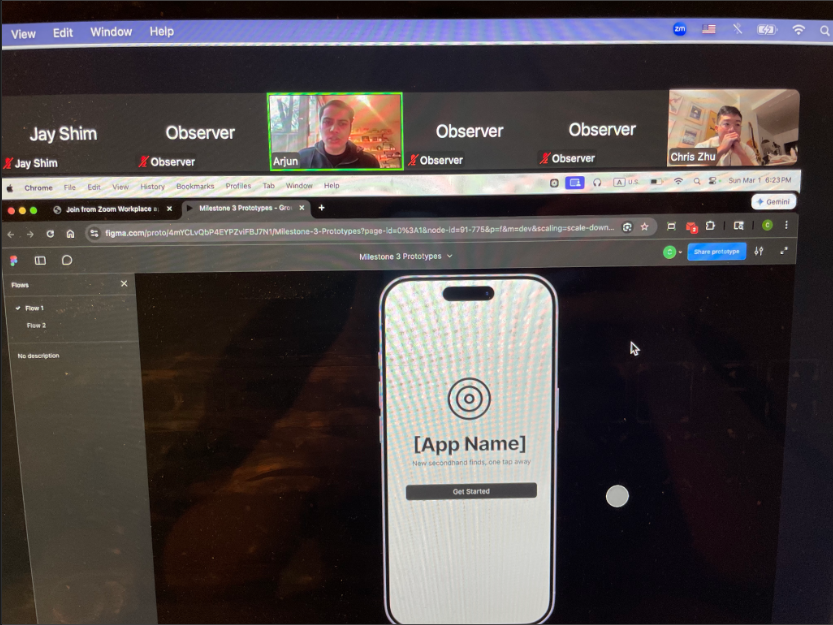
We evaluated a mid-fidelity Figma prototype using task-based usability testing.
Participants were asked to:
Complete onboarding
Search for stores
Search for items
Navigate within a store
Implemented a think-aloud protocol, where participants verbalized their thoughts while interacting with the interface.
We measured:
Task success
Completion time
Errors and confusion points
Key Insights
From Interviews
Store organization is a major issue - there is no clear standard
Price, condition, and quality are key decision points
Shoppers were uncertain as to whether bartering was accepted or even expected
Shoppers frequently compared prices across similar stores or platforms to ensure they were getting a good deal
Many participants felt unsure whether they had fully explored a store, leading to frustration and second-guessing
From Usability Testing
Search functionality was unclear. Multiple search entry points (Landing page, Item Search Page, Store Search Page) created confusion and hesitation (Violation of Nielsen’s heuristic of “Consistency and Standards”)
Filter options were immediately expected (Mental Models). All 5 users actively looked for filters and were surprised when they were not available (Violation of Nielsen’s heuristic of “Recognition Rather Than Recall”)
App onboarding process lacked feedback and flexibility
Participants wanted:A progress indicator or bar to judge how many steps were left
The ability to skip the onboarding outright (Catered towards power users)
Violation of Nielsen’s heuristic of “Visibility of System Status” and “User Control and Freedom”
Item previews lacked sufficient unique meta-data and detail for high app engagement
Users requested more information on items other than price and size in the preview widget for quicker browsing
Violation of Nielsen’s heuristic of “Visibility of System Status”
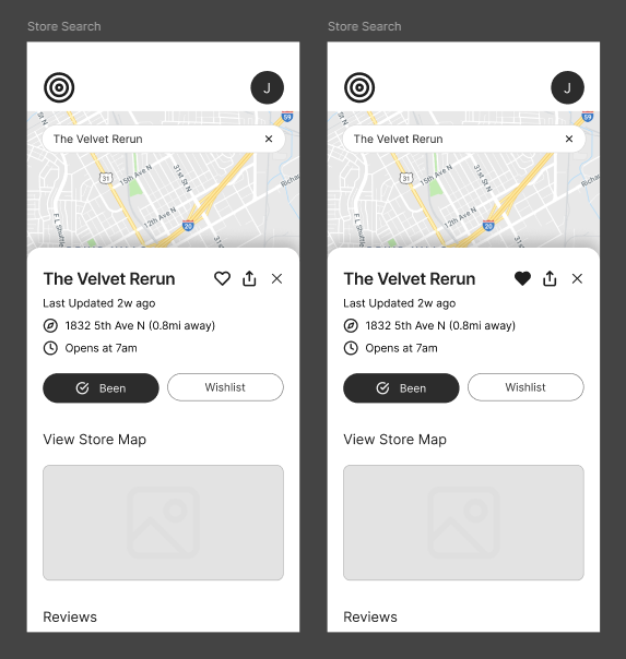
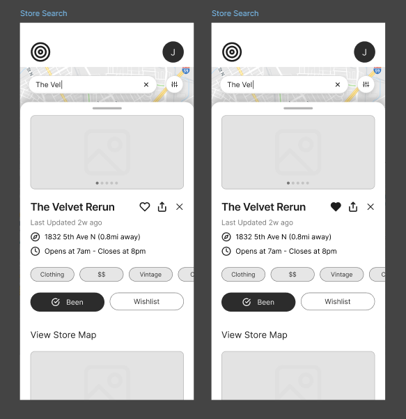
Store previews lacked additional context for the “type” of store it may be
Participants wanted quick insight into store type, price range, overall style, and atmosphere.
Design Decisions
Improved Onboarding Experience
Problem: Lack of clarity and control
Solution:
Added progress indicator bar at the top
Added “Continue as Guest” option
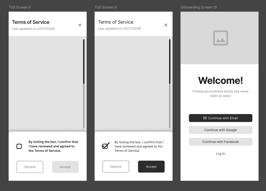
Before
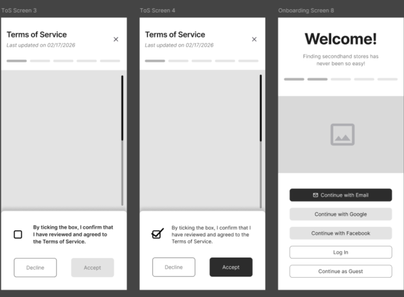
After
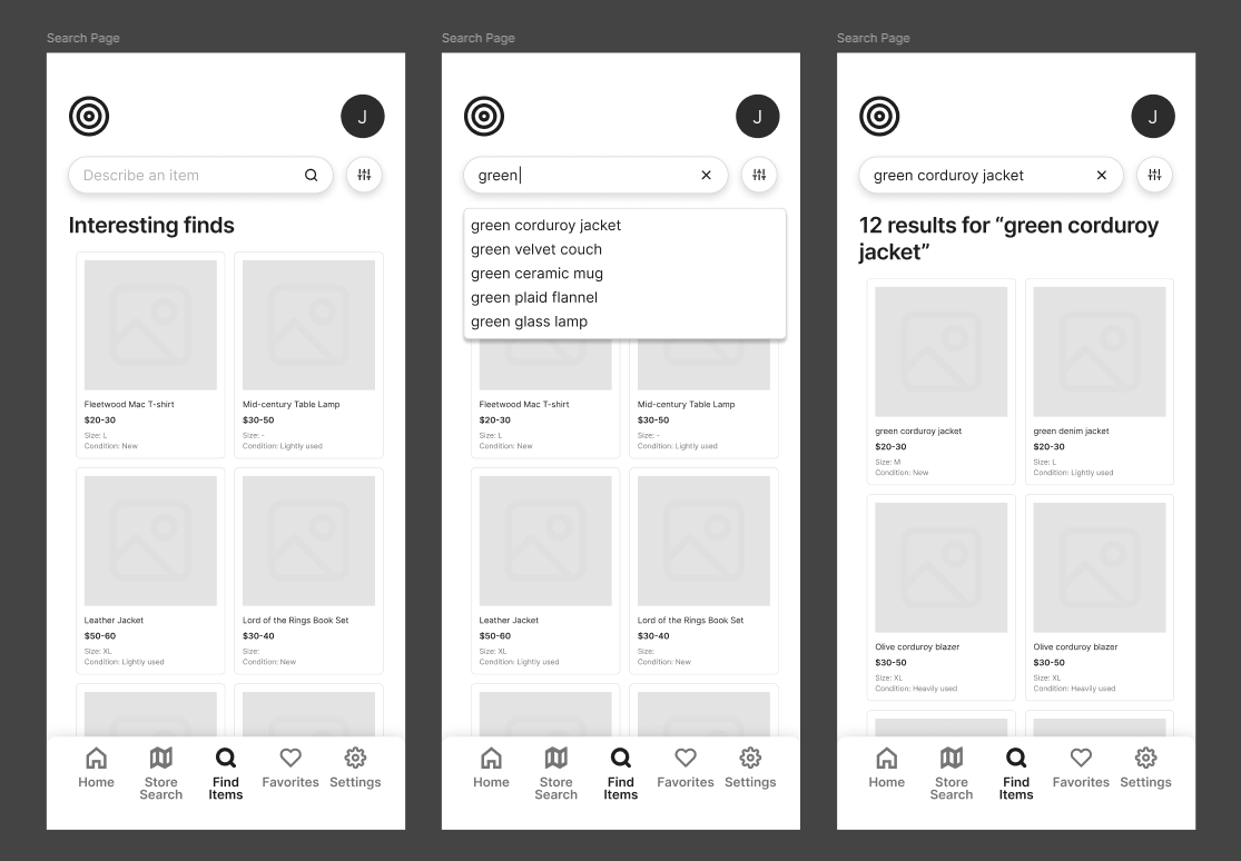
Enhanced Item Search with Filters
Problem: Inefficient browsing
Solution:
Added filters (price, size, condition, etc.)
Added additional meta-data on each preview widget
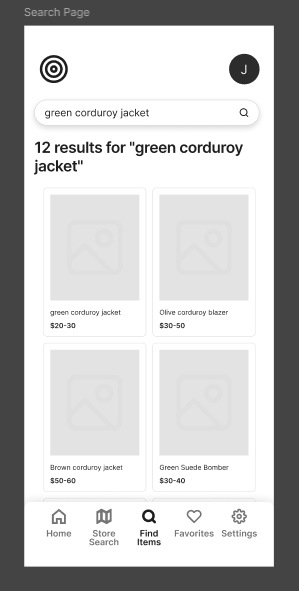
Before
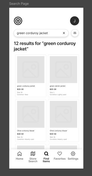
After
In-Store Map
Problem: Difficulty navigating the retail store upon arrival
Solution:
Introduced a store specific map with labeled sections
Section checklist functionality added
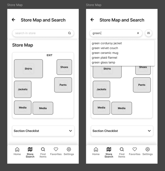
New!
Store Preview Tags
Problem: Limited store context and meta-data
Solution:
Added tags to cater towards power users and new users (e.g. price range via $, $$, $$$, type, style)
Before
After
Outcomes
Improvements
Search became more efficient and structured
Users could evaluate items more quickly
Onboarding felt clearer and more flexible
Store browsing required fewer steps
Remaining Challenges
Some navigation elements (especially the store map) still need refinement
Updated designs have not yet been re-tested
Reflection
Design intent does not always align with user understanding.
Users expect common features (like filtering) by default
Small usability issues compound - leading to significant impact on user flow and experience
Observing real users is more reliable than making assumptions
Effective UX often comes from simplifying, not adding complexity
Next Steps
If this project continued, I would:
Conduct another round of usability testing on the updated designs
Refine navigation and labeling, especially for the store map
Expand onboarding personalization
Test with a broader user base